
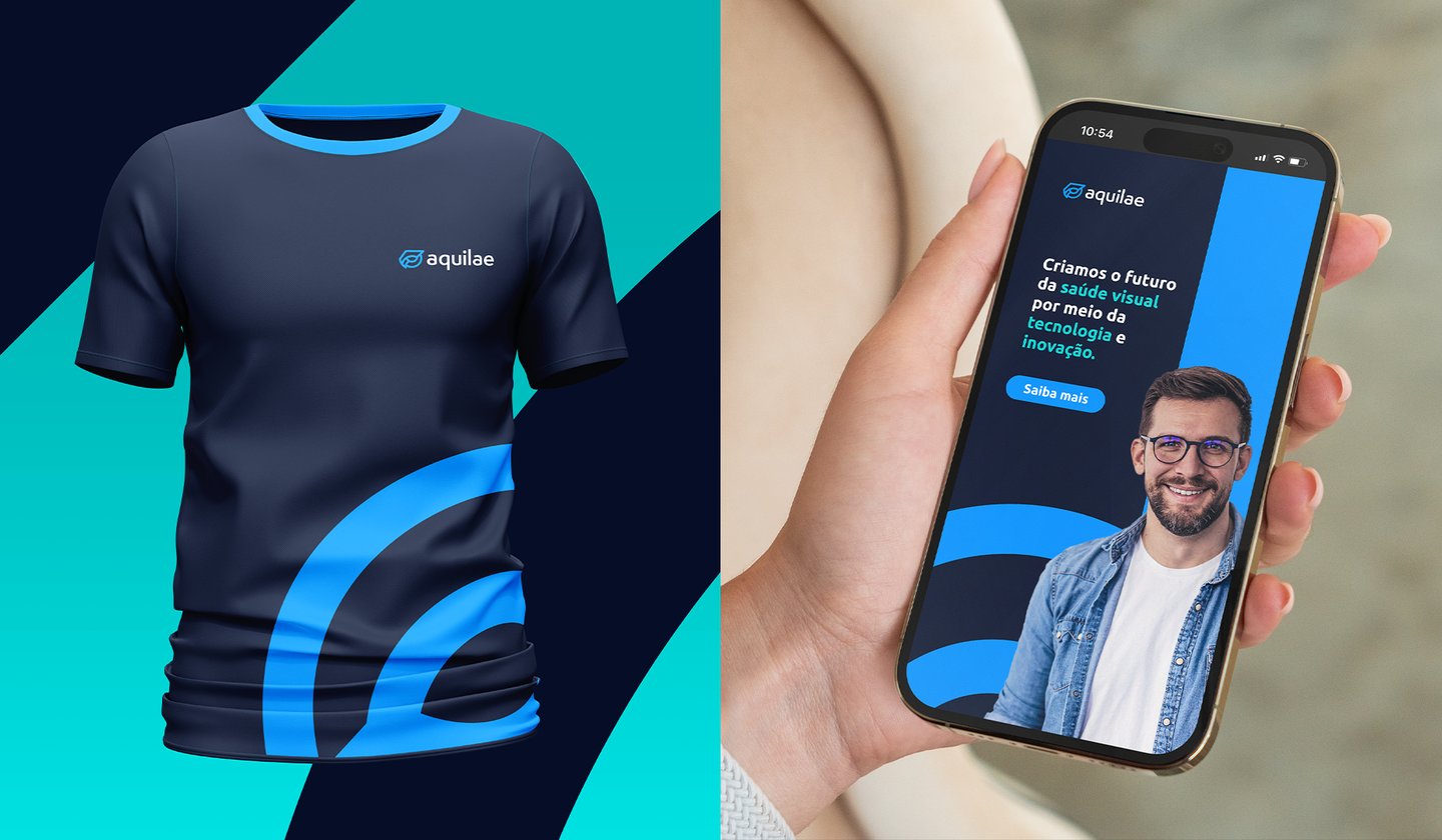
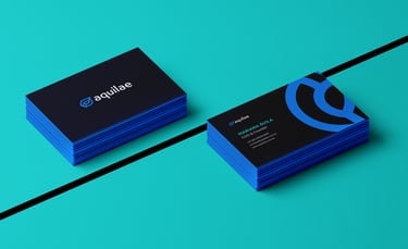
Aquilae
Brand Identity, Brand Strategy and Positioning

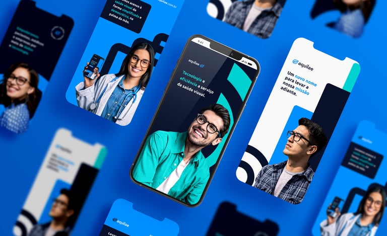


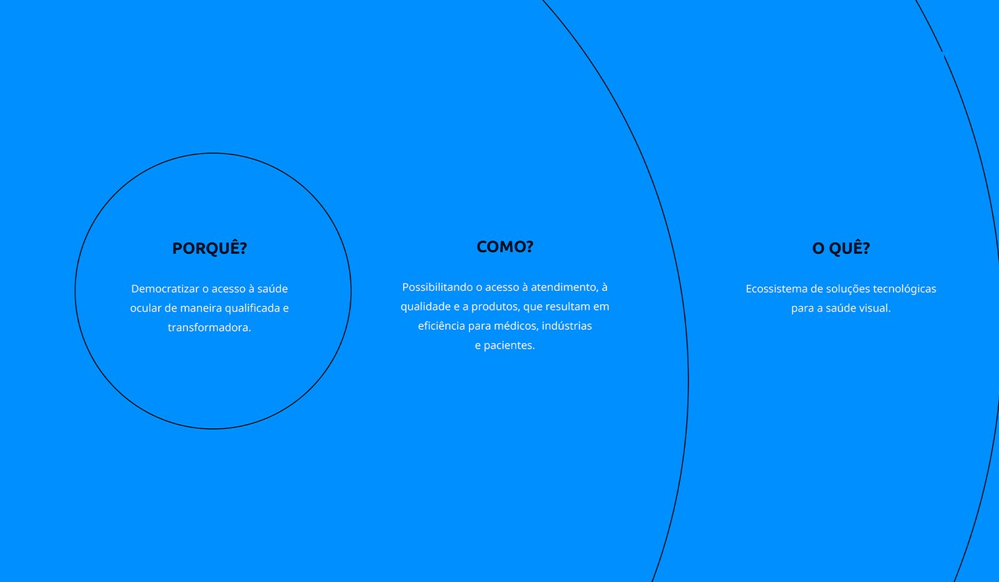


Aquilae is a B2B healthtech startup focused on ophthalmology. The company promotes a culture of preventive eye care, aiming to shift how doctors and businesses view eye exams: caring for your vision isn't a discomfort — it's a matter of health and wellbeing.
The brand helps ophthalmologists manage clinic operations (from finances to patient care) through a software-as-a-service (SaaS) platform. It also helps companies promote eye health among their employees through a vision benefit, in the style of Gympass.
This was a full rebranding project, starting with the company's name (which we cannot disclose due to an NDA). The company's main challenge was a brand misaligned with its expansion goals:
Marketing campaigns weren't delivering satisfactory results;
The name was hard to pronounce and lacked differentiation;
The positioning was serious and rigid, which didn't build closeness;
The communication didn't convey credibility or trust to the target audience;
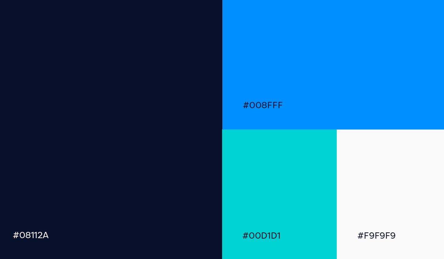
The brand's colors were generic and lacked direction, with no real cohesion;
The company had grown, but the brand hadn't — created in a single day, it no longer reflected who the company had become.
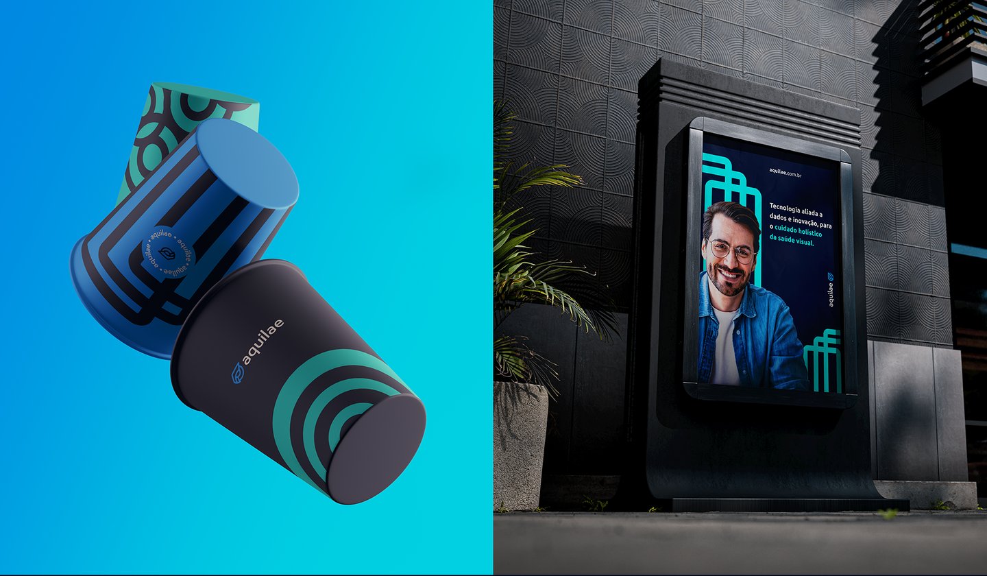
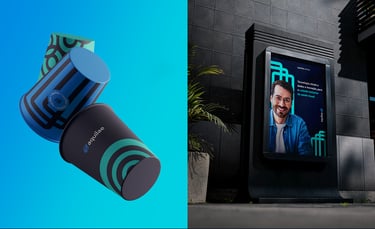
The proposal was to build a brand aligned with the company's international expansion goals — one that conveyed confidence, modernity, and boldness to challenge market standards through innovative, tech- and data-driven solutions. The brand needed to feel modern, while still avoiding the stereotype of colorful, playful startups.
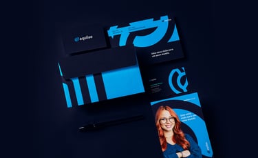
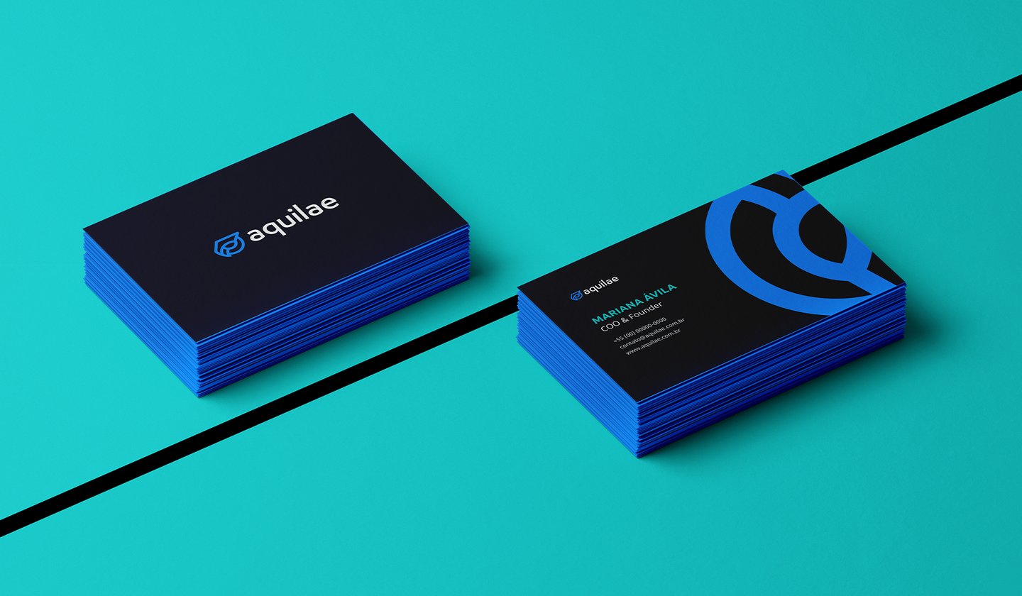
Project Outcome
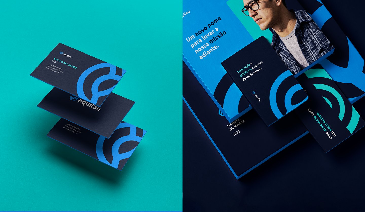
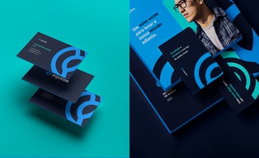
The result was a brand that stopped being seen as "just another healthtech" and started telling its own story: authority, modernity, and clear purpose (without giving up the sophistication the B2B market demands).
A new brand built to grow with consistency, aligned with the international expansion ambition that drove the entire project.


Naming and Symbol
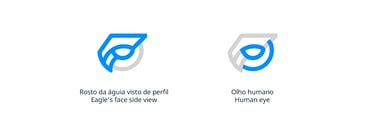
Among its many meanings, one stood out for Aquilae: the eagle is known for its keen eyesight, and in Heraldry, it represents the bird of kings and leaders. Capable of spotting detail from miles away — with a sharpness no other animal can match — no symbol felt more fitting for a brand built to transform eye care.
That's why Aquilae became a symbol of what the company stands for: clarity, reach, and the ability to see beyond. Both for the doctors it serves and for the market it aims to conquer.
Ready to build a brand that works for your business?
No forms, no friction — just a direct message about where your company stands today and where you want to take it.